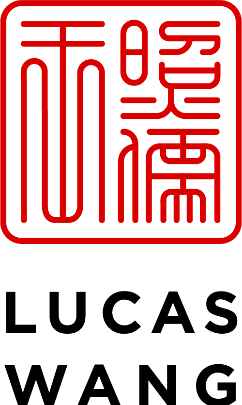
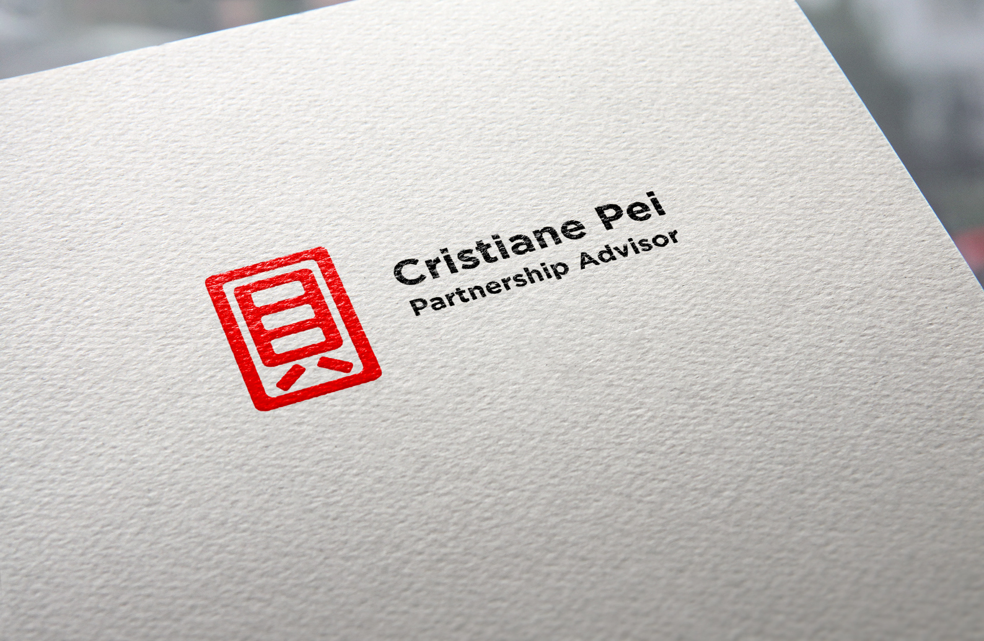
I was asked to create a logo for Cristiane Pei partnership advisor.
She is chinese and most of her clients are as well, she wanted something traditional yet modern and ellegant.
For the logo I simplified the character and it is her surname "Pei" which means Happiness.
I chose the red, because it correspond with fire, symbolizes good fortune and joy. Red is found everywhere during Chinese New Year and other holidays and family gatherings.
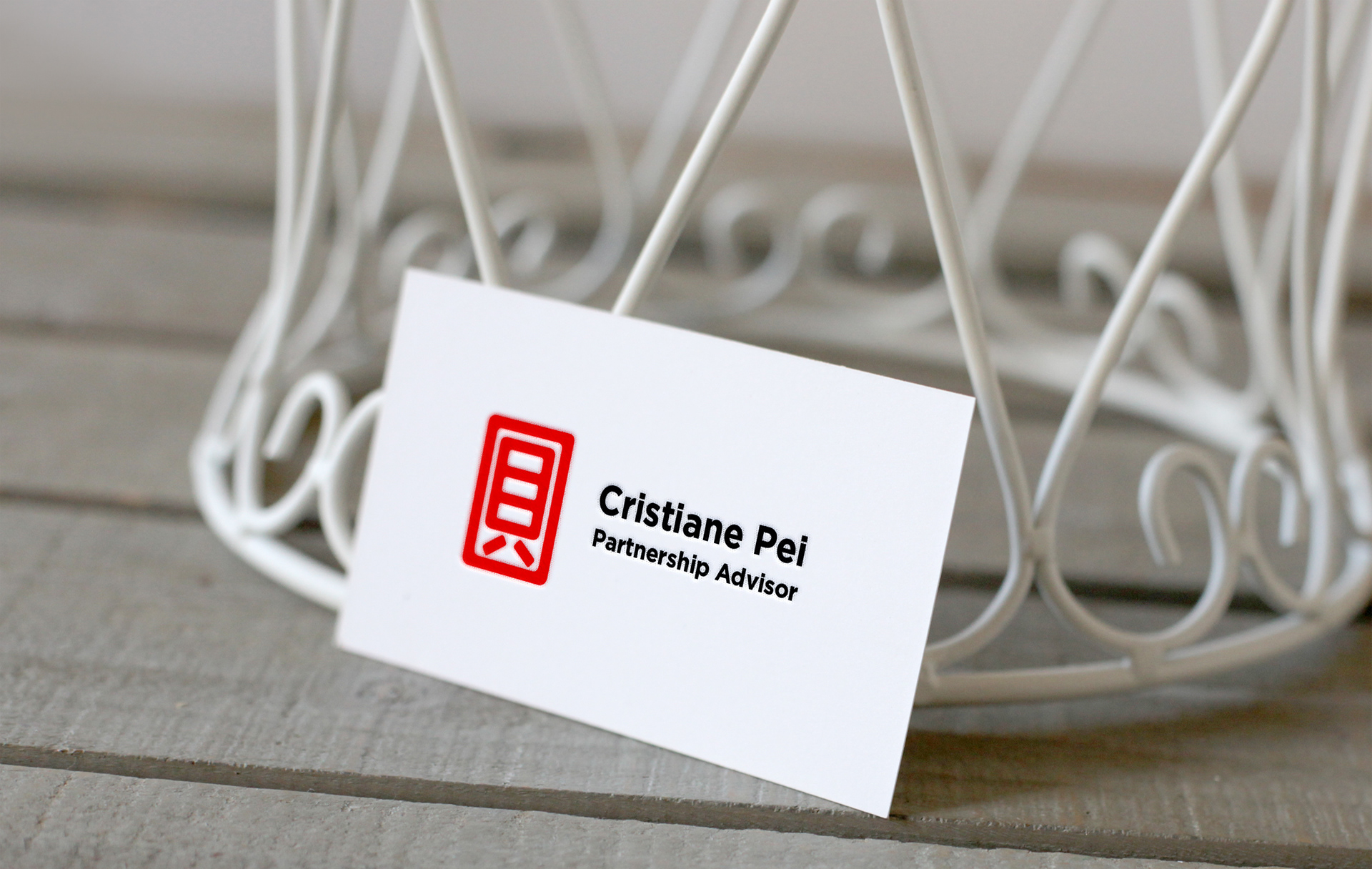
For the business card I used a high quality paper and made a low relief on the red part of the logo.
謝謝